
Methodology
We evaluated companies' commitment towards sustainability using three metrics: annual emissions, intensity, and trend. Then, we sorted companies into six groups based on their performance levels in these metrics.
Emissions & Intensity
Total Emissions (metric tons CO2): Direct emissions from owned or controlled sources (Scope 1) and indirect emissions from the generation of purchased energy (Scope 2). All other indirect emissions (Scope 3) were not included in our analysis because Scope 3 emissions vary widely and are more difficult to classify, report, and account. For example, the emissions data of consulting firms does not include air travel. Due to restrictions from the CDP, we could not release the raw emissions data.
Intensity (metric tons CO2 produced / $ billlion spent): The amount of carbon emissions per each good and service provided. We calculated intensity by dividing total emissions by refined operating costs. Refined operating costs are directly related to the company's day-to-day maintenance, such as research and development, administrative needs, and production costs. Other costs, such as investments in other goods and industries, were not included. This data was taken from publicly available company annual reports.
Which Companies Are in the Dataset
Only companies with public emissions and financial data are included in the dataset. Emissions data was provided from the CDP (formerly the Carbon Disclosure Project), a third-party organization that companies report their emissions to. If we could not access company data from the CDP, we retrieved emissions data from the company sustainability report. Financial data was retrieved from company annual reports.
Our dataset not only includes companies registered for this year’s Career Fair, but also a selection of companies from past Career Fairs. This is because we wanted our dataset to be representative of companies that would normally appear at Fall Career Fair, despite the Covid-19 disruption this year.
Either these companies lack transparency in emissions data, financial data, both emissions and financial data, or are excused. Excused companies include smaller firms (<100 employees) and start-ups (founded 2015 or earlier).To view the list of companies registered for the Career Fair excluded from our dataset, click here.
Grouping Companies Based on Total Emissions and Intensities
We ran a k-means clustering algorithm to sort the companies into different groups based on performance in log(emissions) and log(intensity). We used a log factor because the range of values was too large to create effective groups, due to a few outliers. See Fig 1 for the average emissions and intensities in each cluster before the log operation.
For total emissions, the optimal number of groups was seven. However, to be consistent with the optimal number of groups for intensity, we combined groups seven (which only had two companies) and six for total emissions.
Fig 1: The average emissions from 2016 - 2020 (left) and emissions intensity 2016 - 2020 (right) per cluster.
How to Analyze the Data
Diving into Intensity
Figure 3 shows the intensity data which is the companies emissions divided by their operating costs for every year. We make this calculation in order to better compare companies of all sizes to one another.
Observe how Akamai Technologies Intensity had recently been trending upwards, but made a drastic drop in 2020. What happened in the years previous? Does Akamai plan to continue decreasing its intensity or was this in large part due to Covid? These are questions students can ask at the Career Fair!
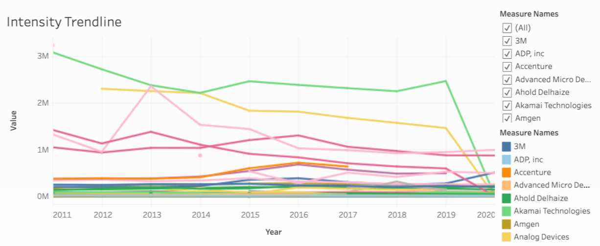
Fig 3: Emissions Intensity data from 2011-2020 for All Companies
Looking at Averages
Figure 4 containes the same type of graph for both intensity and emissions as an average over the most recent 5 years. The raw data for emissions couldn’t be shown in accordance with regulations from the CDP (formerly the Carbon Disclosure Project), a third party organization that companies can report their emissions data to (which is part of the reason we both take a logarithm and average of the data).
The intensity average graph is best used to compare companies of all sizes. If you want to compare just the emissions without operating costs baked in then look at the second graph. Remember that this is a log graph so even though companies may seem close together, their data is likely different orders of magnitude; which is why we used a k-means clustering algorithm on the data to better elucidate the different levels of emissions/intensity that companies operate at. These are color-coded for your convenience.
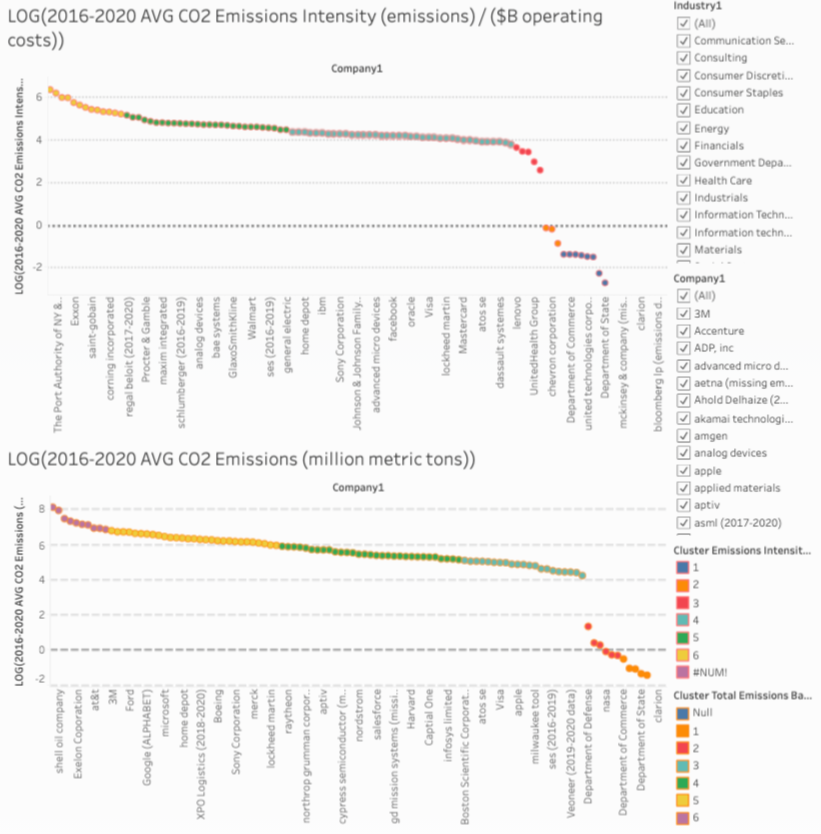
Fig 4: The Avg. Change in Intensity and Raw Emissions for 2011-2020