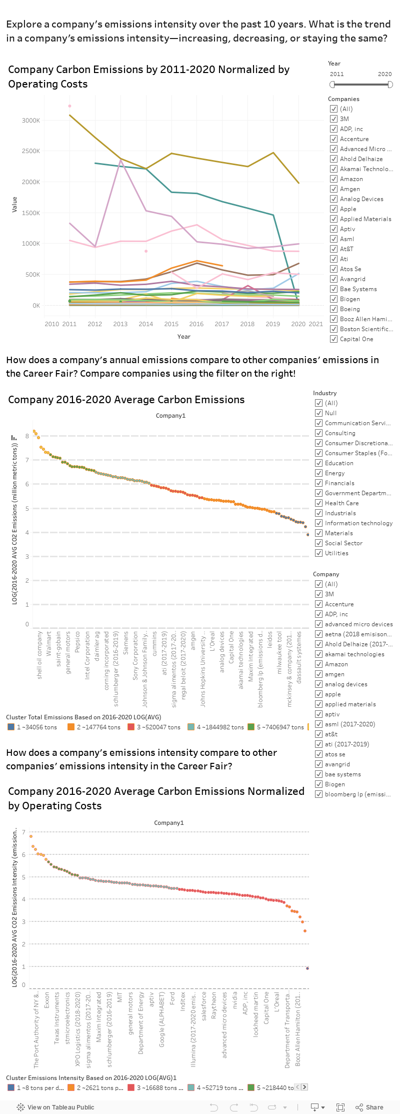
Emissions Data Overview
Through the Tableau storyboard, you can explore how companies in the Fall Career Fair rank relative to each other & see their carbon intensity data. Keep in mind that decreasing emissions is only one way for a company to be sustainable. Students are encouraged to ask companies questions about different sustainability positions as well as other sustainability efforts. Last updated 9/09/21.
With this storyboard, students can compare different companies' emissions data to help them assess a company's commitment to sustainability. The data analysis was conducted by the Environmental Solutions Initiative and made possible by a partnership with CAPD and the sloan sustainability Initiative
If you would like to look at our data here are the 2 csv files we use: accumulated_data & intensities. We omitted some data due to constraints involving the fact that we cannot display past year's data for carbon emissions.
If you would like an in depth explanation on how to use the figures on this page to compare companies and their emissions data, watch this video tutorial below.
Why are some companies missing from this analysis?
These companies lack transparency in emissions data, financial data, both emissions and financial data, or are excused. Excused companies include smaller firms (<100 employees) and start-ups (founded 2015 or earlier). To view the list of companies registered for the Career Fair excluded from our dataset, click here.
Definitions
- Carbon Emissions- These are the yearly carbon emissions a company directly produces.
- Carbon Intensity- This is a metric we came up with that is the Carbon Emissions dviided by their operating costs, which allows us to compare small companies to large companies more fairly.
- Clustering- We clustered the copmanies into 6 groups based on a log of both their carbon emissions & intensity. Each group has at least an order of magnitude difference and this gives us a quick way to see the difference between companies. For an idea of this log scale difference take a look at these two graphs showing the avg emissions and intensity for each of the 6 groups (clusters)—notice the exponential growth. More on the methodology page about this.
Graphs